LCC Synod Convention dates set, logo released
CANADA – Delegates of the 2020 Special Convention passed a resolution allowing the 2021 Synod Convention to be postponed to 2022. The LCC Board of Directors has set the date and location. The convention will be held June 10-13, 2022 at the Edmonton South Conference Centre (Delta and Radisson Hotels).
The LCC Handbook has been revised to reflect the change to Statutory Bylaw Article IX 9.01, in light of the aforementioned resolution being passed (Resolution 20.1.01). No other changes have been made to the LCC Handbook. The revised Handbook has been sent, by email to congregations, pastors, deacons and 2020 Special Convention delegates. A printed copy is available by sending a request to admin@lutheranchurch.ca. You can also access the revised Handbook on LCC’s website under “Congregational Resources”.
Planning is underway for the 2022 Convention, and further details will be announced when available.
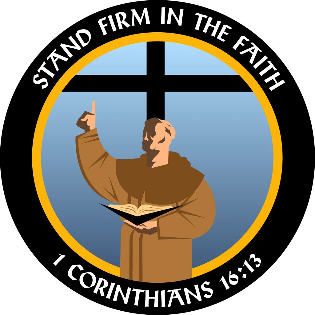
The theme of the convention is Stand Firm in the Faith 1 Corinthians 16:13. The convention logo was designed by Harrison Avery Prozenko, whose father, Philip Prozenko, actually designed the 2017 Synod Convention logo. They are both members of St. Andrew’s Lutheran Church of Atlantic Canada in Halifax.
Artist Statement
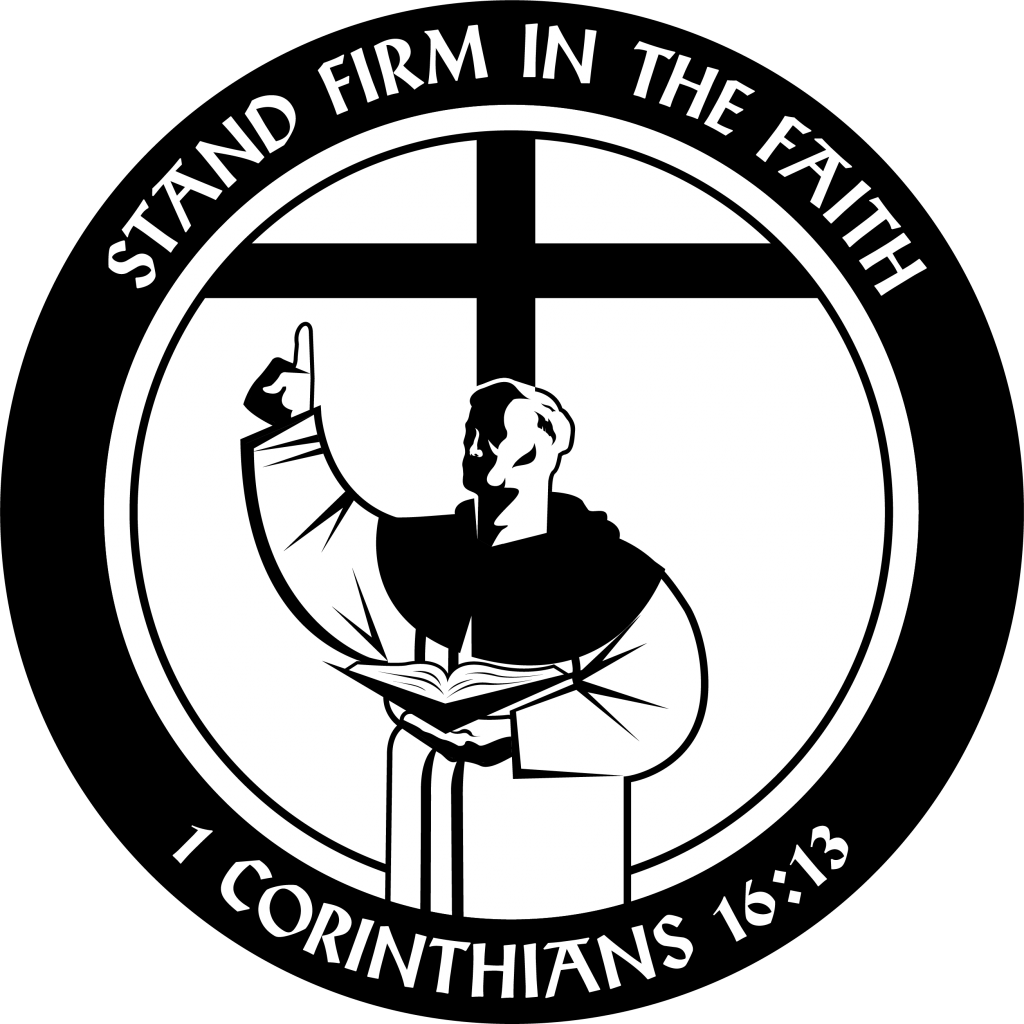
LCC 2022 Convention logo in greyscale.
by Harrison Avery Prozenko
My work has always had some connection to Christianity and Lutheranism. There is a visual need to communicate the Lutheran faith to the world, moments like the Diet of Worms need proper representation. A logo that is rooted in and is symbolic of the celebrated occasion.
I’m inspired most by early 20th century graphic design, the blend of traditional and modern visual language creates a classic aesthetic that isn’t seen too often. Early German trademarks are bold, stark, minimal yet very descriptive. They are instantly recognizable but don’t sacrifice their readability as some of todays’ logos do for the sake of looking sleek and modern. Older visual styles are a breath of fresh air amidst the cacophony of overly simplistic and ultimately boring designs.

Harrison Avery Prozenko
Russian Constructivism is another inspiration. Its composition usually seems disconnected with its content but it has a habit of abstractly interesting the viewer whilst delivering its information. Taking cues from Constructivism’s use of colour and most basic shapes, the design for the 2021 synodical logo brings forward the iconic moment of world history in an instantly recognizable emblem.
The Diet of Worms is a pivotal moment in church history, in this logo I’ve tried to bring together the imagery of the moment with the legacy of the cross into modern design language. It is representative of a moment that has resounded for 500 years the steadfastness of our faith in Christ and our trust in his word. As in the logo itself, Martin Luther may have brought the Word back to the forefront, but it is Christ Himself and His death on the cross that brings this truth to us.
———————
